Reimagining the traditional annual report.
When we got asked to take a traditional Annual Report and spin it on its side…we were pumped.
Clearly we’re not paper people. We live in the digital sphere of influence, using creative tools and innovative approaches to elevating your brand online. Whether it be websites, social media, logo design — you name the digital tool, we’ve got you covered.
Which is why it pains us to know how many companies are still hanging on tight to their printed Annual Report…or maybe a downloadable PDF *face palm*.
So when we got asked to take a traditional Annual Report and spin it on its side…we were pumped.
The Ask
Create an engaging and visually appealing annual report (a.ka. not boring!)
Problems to tackle
CUPS had dabbled with a digital annual report in 2020 and while it was considered a successful start to the new approach, they were looking for more design expertise to take the content and elevate it with a creative focus. That’s where FirstUp came in.
There were four key problems we were tasked with solving:
- How to display a significant amount of data (varying lengths) in an interesting way
- How to keep viewers engaged through the sheer volume of required content
- How to ensure viewers could still get the gist of the report without clicking through to the longer-form articles
- How to keep it story-focused and not just a boring, clinical list of facts and required reporting
Creative solutions
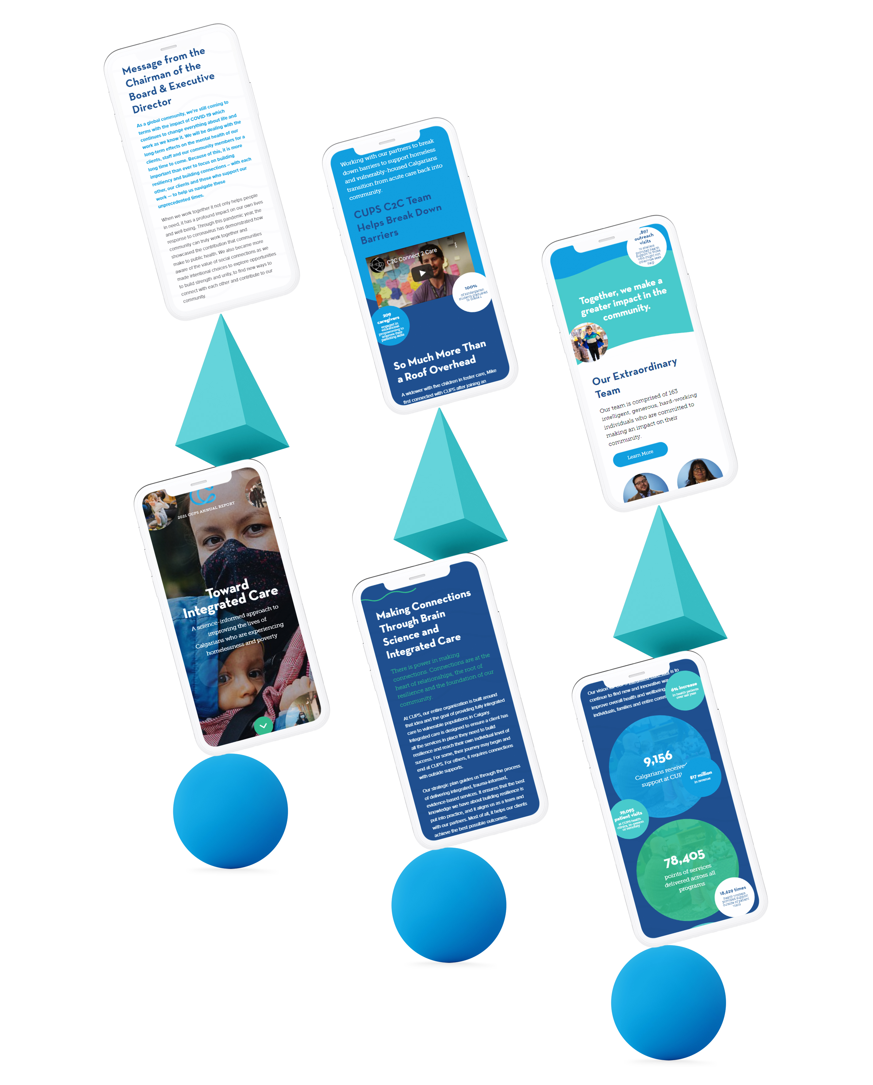
Movement
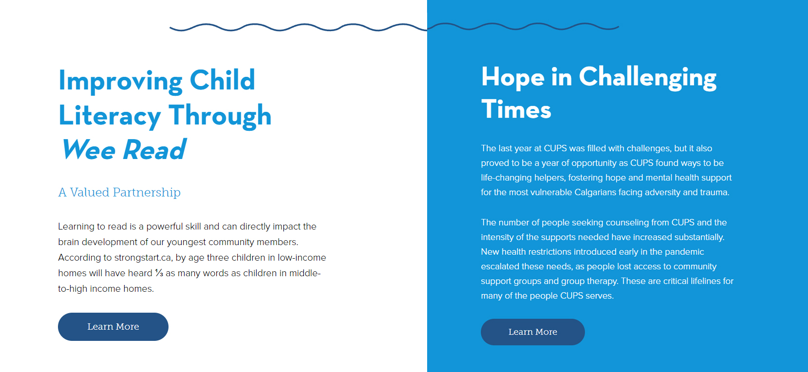
One of the biggest opportunities that comes with a digital Annual Report is the ability for movement — and we’re not just talking about scrolling down a page. Using a variety of CUPS brand elements, we pulled in one of their wavy design features, with lines moving across the page to draw the eye to certain stories. By using these waves, others animations and data bubbles (more on that below!), we established a unique look and feel for the report, while still staying true to the brand of the organization.
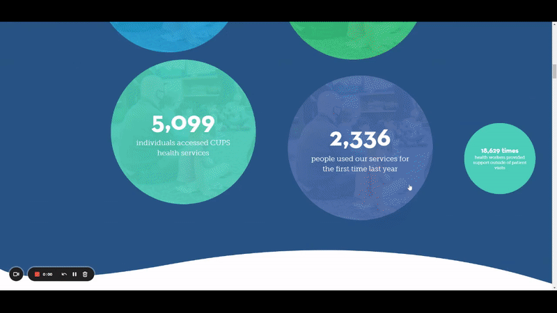
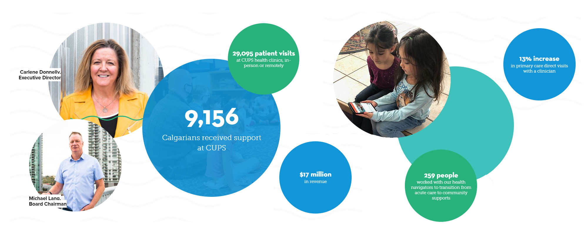
Data Displays
No one wants to read a list of data points — it loses its impact, which is exactly the opposite of the primary objective. By using bubble features and different sized text within those bubbles, we could draw attention to important points. And instead of having the data all together like a periodic table, we placed the bubbles all over the site, moving across your screen to draw the eye.
Content teasers
A good Annual Report is a story; sharing the impact of the past year through a combination of engaging content and data. It needs to be human-focused and elevate the stories of people that are being supported. The report was designed for storytelling and through that, we moved away from walls of text and set it up for viewers to read through the report from top to bottom. The reader can get a sense of impact from every individual story and the overarching theme of CUPS without a single click.