(RE)Introducing FirstUp
A walkthrough of our new visual identity
Sometimes you need to hit the ground running, and in the case of the FirstUp origin story - it couldn’t have been more applicable.
Over the course of a week - a brand, a website and digital strategy was born to support our collective mission and value systems at FirstUp.
We were also fortunate enough to have a combination of clients that trusted us, and a network of agencies that we could white label through. Meaning, that right from the get-go, we were pretty darn busy. As a result, we never had the opportunity to dedicate the time needed to creating our brand identity. We mocked something up quick and ran with it!
After launching 20+ websites and a handful of new brands since then, we have been blessed with a moment to catch our breath and refocus our attention internally - we had the opportunity to revisit the visual identity we created for FirstUP.
A new life
When we were undergoing the process of WHAT the new logo should entail, we explored various paths and routes to get where we are.
We explored our love of 8-Bit gaming, looking to encapsulate and symbolize "1UP" in the context of being an extra life, or a new beginning. As this path was explored, we found it pigeonholed us into a creative style that might not be how we want to be seen from the outside.
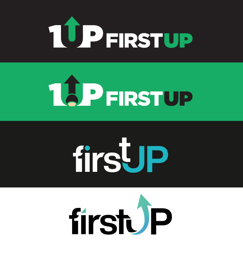
Fine-tuning the original
Next we were looking at the logo that we adapted for our launch. Well, this twenty minute logo also had merit, but it might just need some fine tuning... So we explored this further, changing the colours and pairing it with a unique, and accessible humanist sans-serif wordmark, which actually worked out quite nicely but didn't have the uniqueness, or modern flow we wanted.
We wanted to avoid any stark contrasts, or jagged edges. We wanted our identity to encapsulate a smooth flow that is conducive of working with FirstUp.
The customization on the typography was giving the flow, and uniqueness we were aiming for, but something just wasn't working. The symbol definitely had to be secondary to the wordmark, but highly visible despite it's weight being less... which this wasn't. In fact, it was blocky, and stereotypical, and looked like we were selling options strategies to stock traders. That was it, back to the drawing board.
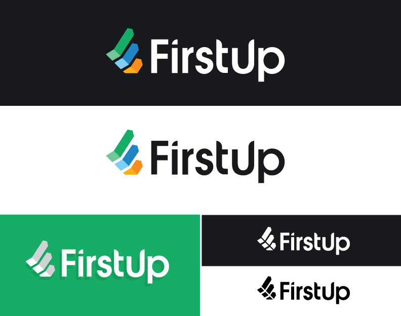
The dramaticized "F" has to stay. Lettermarks are all the rage, cool, and we love them more than pigeon holing into something actually symbollic... But what does FirstUp mean to Us?
The water. The sky. Everything in-between.
Well first and foremost, we are ALWAYS the first one's to start working in the morning, without fail. So clearly, we needed a simple representation of this in including the morning sun. We're also often the last to stop working... So maybe it's a setting sun, too.
We're passionate outdoors enthusiasts, whom love our communities and exploring where we live. How do we reflect this in a simple Lettermark symbol? Well, turns out you can't without making up some incredible story that just isn't true, so we stuck to using our favourite colours from the natural splendor that we call home.
Our skies and lakes in the Okanagan and Shuswap are home to unique palettes not seen many other places in the world - so we thought we'd combine them in a soft way, while still getting the retina burning punch our colour palette needed.
From the Shuswap Lake to Lake Okanagan and Kalamalka, we have different colours - but across all these lakes the peaks of our foothills and mountains create some of the most stunning orange and pink hued sunsets and sunrises seen anywhere in the world... And that's pretty cool.
Are you still here? We're still here. And now hopefully, more easily recognizable.
TL;DR: We changed our logo.
.jpg)
![]()